help center page Restructure
ux writing • jan – feb 2021
Project Background
For users needing to get answers to basic questions, such as the “how-to’s”, available services, and travel policies, the Help Center was their first go-to source. Yet, our read-to-contact rate hovered around 11%. The read-to-contact rate came from the number of users visiting a particular article in the Help Center but ended up contacting Customer Service. The objective of this project was manpower efficiency: To reduce the read-to-contact rate from 11% to 5.5%, hence deflecting about 20,700 users from contacting Customer Service agents.
How i helped
Article audit and analysis
Observed user research and synthesized findings with the Interaction Designer
Developed the guiding principles with the Interaction Designer
Created the copy solutions
problem
Upon conducting article audits and user research, we found these problems with our previous Help Center page design:
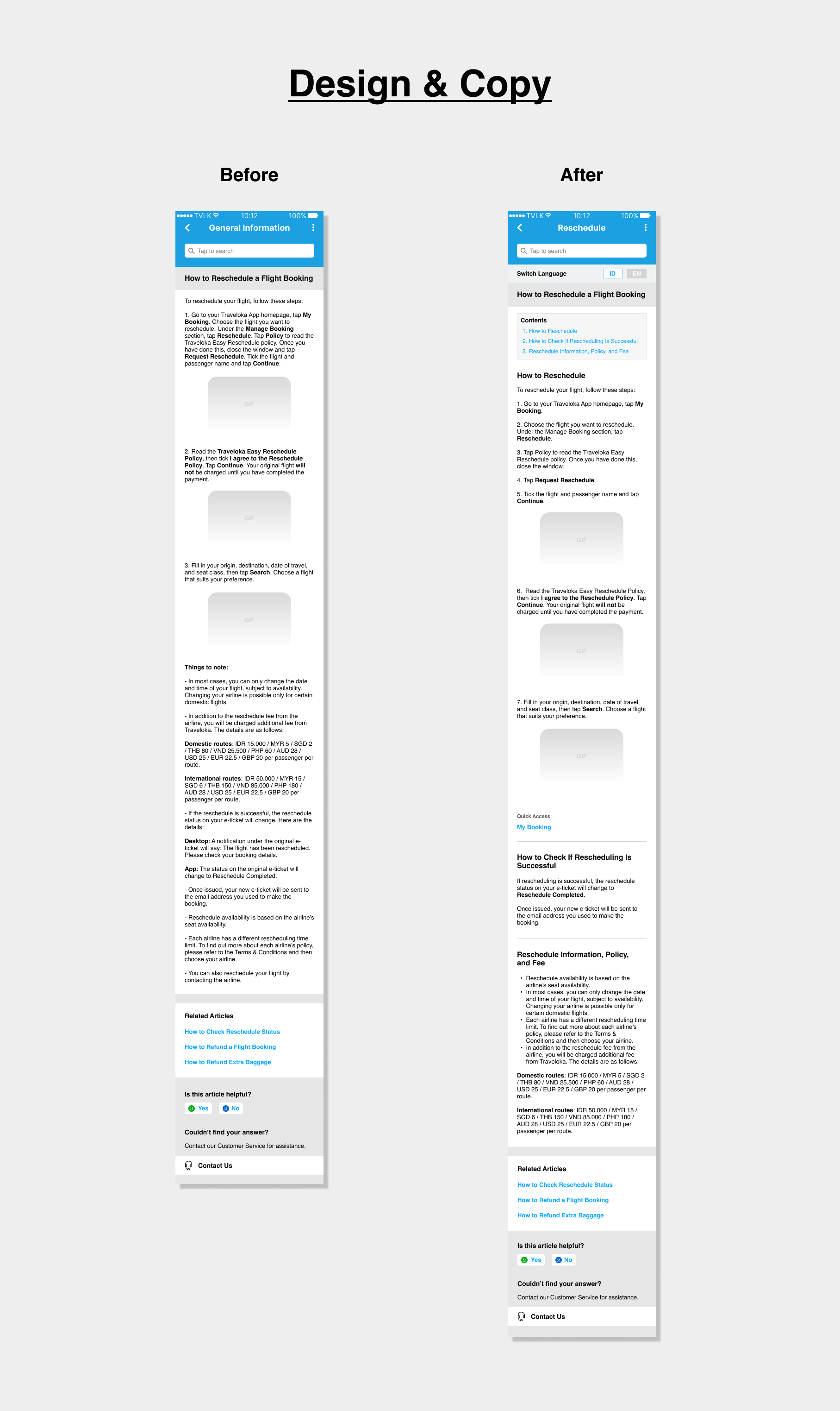
Article titles were too long and did not include specific contexts, such as a product/service name, which made it hard for users to skim through and choose the relevant article for their problems. The absence of context specificity also led users to the wrong article.
Articles were written in long paragraphs, which were discouraging for users to read and made it harder for them to find relevant information.
Some articles mentioned features or other relevant information that could be useful but didn’t provide access to them.
Solution
To organize our design and copy solution, we developed design guiding principles. Below are the principles and my corresponding copywriting solutions:


Natural
Use my language and thinking process in showing and structuring the Help Center information, so I can easily find what I’m looking for and solve my own problem.
Complete & Fluid
Provide me with all information that pertains to my topic from different Help Center entry points that make sense to me.
When I’m supposed to be able to solve my own problems, provide me with direct access to the right tools.
Clear-cut
Present me with information I can skim, infer easily, and comprehend quickly.
Concise Titles
Whether by navigation or through the search bar, users come to Help Center looking for keywords that reflect the topics they have in mind. Since our SEO system can only search through titles instead of an entire article, relevant keywords (i.e. nouns) need to be immediately identifiable.
I implemented declarative sentences (statement format) in the style of news headlines and omitted pronouns in titles when appropriate. The headline style without pronouns accommodates users’ keyword-searching behavior while offering a sense of immediacy and improving visibility.
Familiar Terms
“Content” or the Indonesian “konten” is commonly used to refer to information available in electronic products or media. So, to offer familiarity, consistency, and accuracy of meaning, I used the words “contents” and “konten” to refer to the subtopics within an article.
Subtopics
Sometimes a few topics need to be discussed under one article, but doing so can deter users from reading it. So, I made the information more visible by creating subtopics.
“Related Articles” Section
From our user research, users reading a particular topic also sought other information related to the topic. For example, users reading “how-to” information about rescheduling would also want to know if they have other alternatives (e.g., refund), what to do with their previously purchased baggage, or how to check their rescheduling status. So, I included all three related information as Related Contents for easy access.
Feature/Page Names in Quick Access
The new design also features the capability to direct users to relevant features/pages called Quick Access. Here, I included feature names as they were written on the page to ensure consistency.
Product Names in Titles
To increase clarity, I incorporated relevant product/feature names in titles when appropriate. This makes the article more contextual in the sense that it enables users to identify more quickly if the article is about the specific product/feature they want to know about.
Flowing Titles – Subtopics
Since users skim, they need to be able to infer the article’s whole content as soon as they see it. To help them get an idea of the different information the article contains, we provide a list of contents under the title.
Here, I made sure to keep the subtopics in the style of the title: in a concise headline style that highlights the users’ keywords. I also crafted the subtopic copy so that they flow with the title, in sequences that follow the users’ journey.
outcome/results
Articles that have used the new design are showing a declining read-to-contact rate. However, at the time this portfolio was crafted, the new design had not been implemented in enough articles for us to know if we had succeeded in achieving our read-to-contact target.